CSSボタンのデザインとホバーエフェクトのアイデア
基本的なCSSボタンの作り方
<a>タグでのCSSボタン
aタグをブロック要素にしたシンプルなCSSボタンのデザイン例。マウスオーバー:hoverでボタンの背景色を変化させ、変移をスムーズ(なめらか)にアニメーションさせるようにtransitionを設定しました。
<a class="button01" href="#">Button</a>
    .button01{
        display:block;
        width: 250px;
        height:70px;
        line-height: 70px;
        color: #FFF;
        text-decoration: none;
        text-align: center;
        background-color: #f39800; /*ボタン色*/
        border-radius: 5px; /*角丸*/
        -webkit-transition: all 0.5s;
        transition: all 0.5s;
    }
    .button01:hover{
        background-color: #f9c500; /*ボタン色*/
    }
<input>タイプのCSSボタン
フォームで使われるボタンsubmitbuttonのCSSも大体同じ設定。フォームのボタンはボーダーが残るのでborder: none;としてボーダーを消します。
<input type="submit" class="button02" value="CSSボタン">
    .button02{
        display:block;
        width: 250px;
        height:70px;
        line-height: 70px;
        color: #FFF;
        text-decoration: none;
        text-align: center;
        background-color: #f39800; /*ボタン色*/
        border-radius: 5px; /*角丸*/
        -webkit-transition: all 0.5s;
        transition: all 0.5s;
    }
    .button02:hover{
        background-color: #f9c500; /*ボタン色*/
    }
立体的なCSSボタン
よくみられるフラットでありながら立体感のあるCSSボタン。クリック(ボタンを押しこむ):active表現を加えたデザイン。
<a class="button03" href="#">Button</a>
    .button03{
        display:block;
        width: 250px;
        height:70px;
        line-height: 70px;
        color: #FFF;
        text-decoration: none;
        text-align: center;
        background-color: #f39800; /*ボタン色*/
        border-bottom: solid 6px #ec6c00; /*下線色*/
        border-radius: 5px; /*角丸*/
    }
    .button03:hover{
        background-color: #f9c500;/*ボタン色*/
        border-bottom: solid 6px #f39800; /*下線色*/
    }
    .button03:active {
        margin-top: 6px;
        border-bottom: none;
        -webkit-transform: translateY(6px); /*下移動*/
        transform: translateY(6px);
    }
アイコンフォントを使用したCSSボタン
③のボタンにアイコンフォント「FontAwesome」をテキスト文頭に配置したCSSボタン。簡単にCSSのみでデザインされたボタンを作成できます。
<a class="button04" ><i class="fa-solid fa-circle-chevron-right"></i> CSSボタン</a>
    .button04{
        display:block;
        width: 250px;
        height:70px;
        line-height: 70px;
        color: #FFF;
        text-decoration: none;
        text-align: center;
        background-color: #f39800; /*ボタン色*/
        border-bottom: solid 6px #ec6c00; /*下線色*/
        border-radius: 5px; /*角丸*/
    }
    .button04:hover{
        background-color: #f9c500;/*ボタン色*/
        border-bottom: solid 6px #f39800; /*下線色*/
    }
    .button04:active {
        margin-top: 6px;
        border-bottom: none;
        -webkit-transform: translateY(6px); /*下移動*/
        transform: translateY(6px);
    }
FontAwesomeの使い方については関連記事をご覧ください。
CSSボタンの制作で役立つサイト
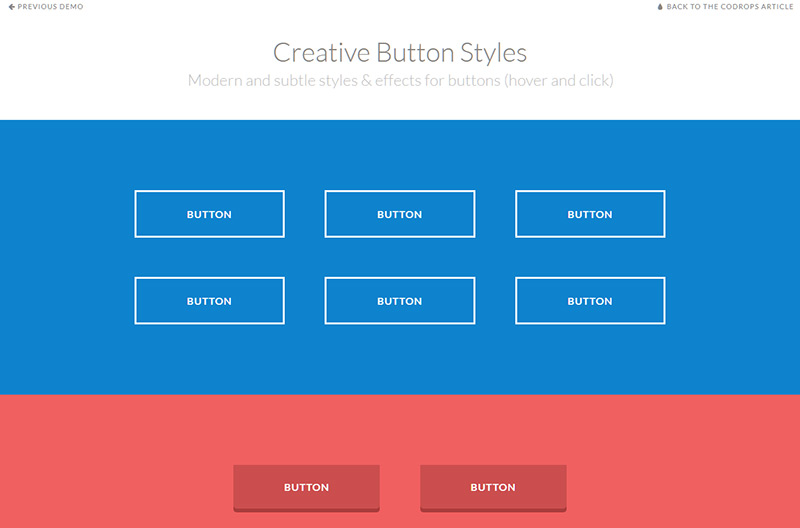
Creative Button Styles
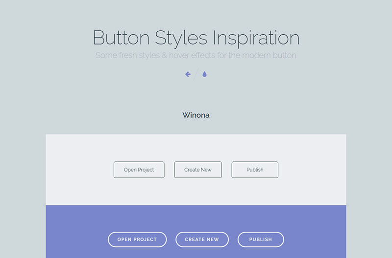
Button Styles Inspiration
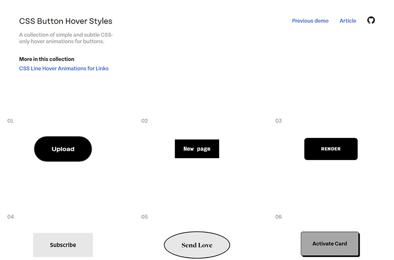
CSS Button Hover Styles
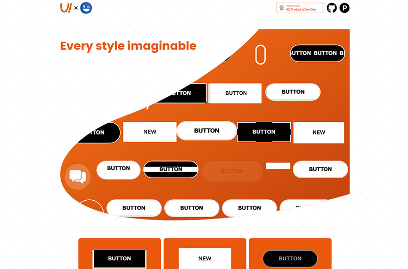
UI Buttons
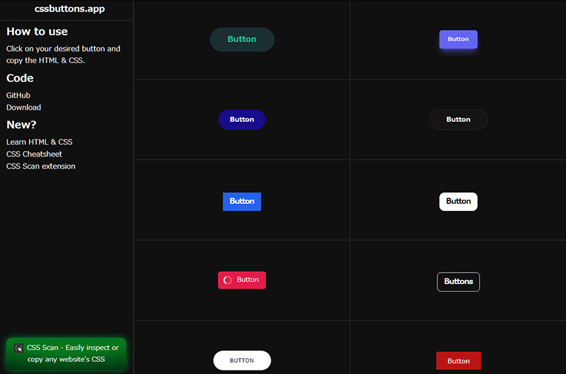
cssbuttons.app
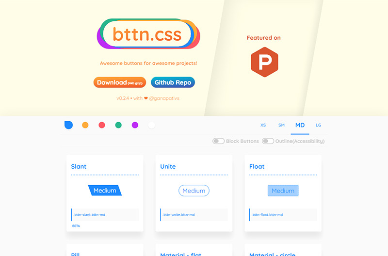
Bttn.css
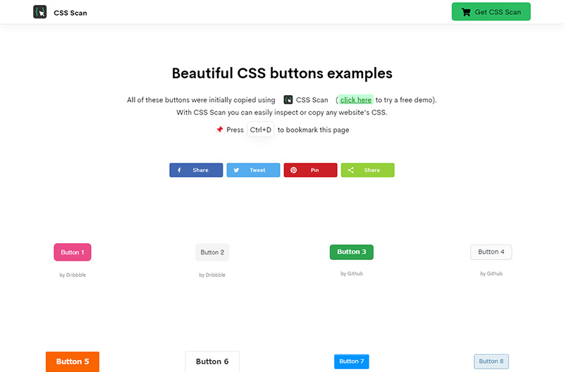
CSS Scan
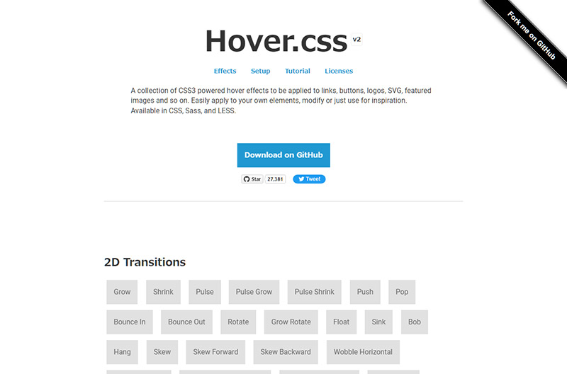
Hover.css
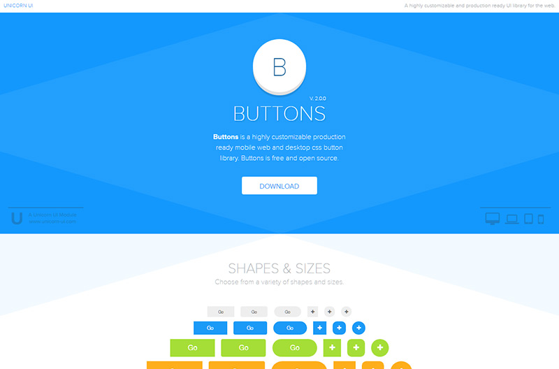
Buttons
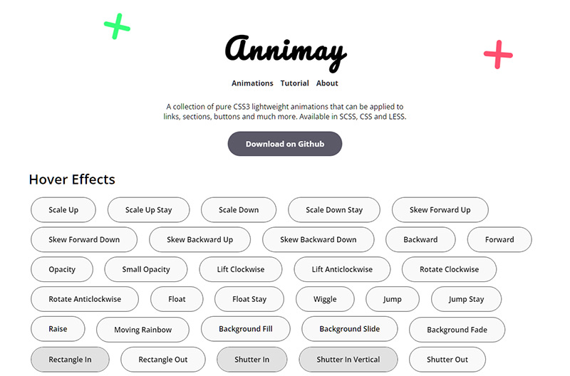
Annimay
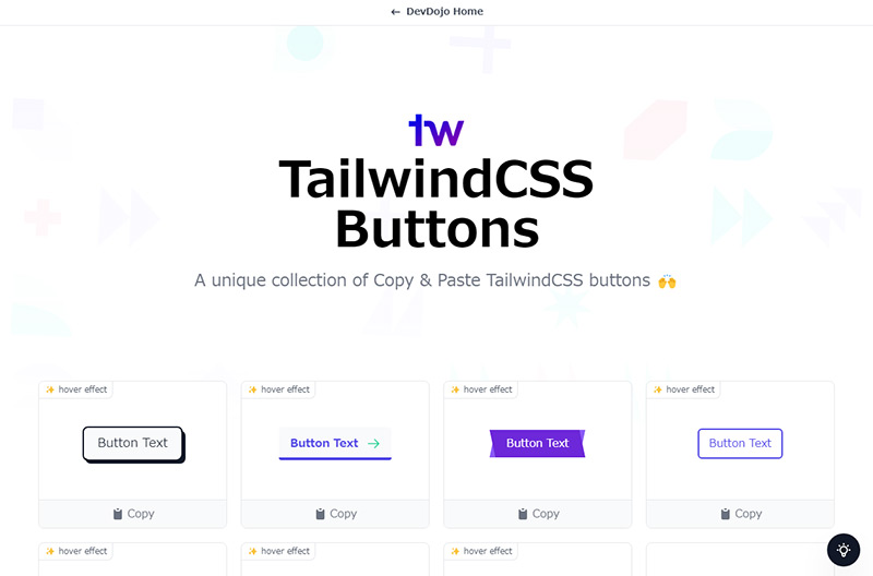
TailwindCSS Buttons
CSSボタン制作のアイデア
20 Button Hover Effects
ベーシックなものからフラップ・シャドーまで実用的なスタイルのCSSボタン
See the Pen 20 Button Hover Effects by Rosa (@RRoberts) on CodePen.
Six Pure CSS Button Hover Animations
ボーダーと背景を入れ替えるアニメーションのCSSボタン
See the Pen Six Pure CSS Button Hover Animations by Christian (@CTNieves) on CodePen.
Collection of Button Hover Effects
ホバーエフェクトに工夫を凝らしたCSSボタン
See the Pen Collection of Button Hover Effects by David Conner (@davidicus) on CodePen.
Amy Winehouse Doc Button
Blobs button
CSS3 Social buttons vol.1
5タイプのバリエーションのホバーエフェクトのアイデア
See the Pen CSS3 Social buttons vol.1 by foxeisen (@foxeisen) on CodePen.
Gradient Buttons with Background-Color Change
グラデーションに変化をつけたホバーエフェクトのアイデア
See the Pen Gradient Buttons with Background-Color Change (CSS-only) by MrPirrera (@pirrera) on CodePen.
Animated hover button
カーソルがボタンの領域に入った座標からバブルのアニメーションが広がるボタンデザイン。【JavaScript使用】
See the Pen Animated hover button by Sammy Helali (@Lunoware) on CodePen.
Magnetic button animation
カーソルがボタンに近づくとボタンが磁石に吸着しようとするエフェクトが魅力的なボタン。【JavaScript使用】
See the Pen Magnetic button animation by Milan Raring (@milanraring) on CodePen.
MAGNETIC BUTTONS
カーソルがボタンに近づくとボタンが磁石に吸着しようとするエフェクトの円形ボタン。【JavaScript使用】
See the Pen MAGNETIC BUTTONS by ArtemTsivilev (@artemtsivilev) on CodePen.
Arrowed link circle on hover
SVGパスと破線を使用して表現したサークル状の矢印のアニメーションが特徴的なボタン。
See the Pen Arrowed link – circle on hover (cf Google Home website) by Alex Jolly (@SachaJolly) on CodePen.
SVG Circle button animation
ラインアニメーションが特徴的なサークル状のCSSボタン。
See the Pen SVG Circle button animation – CSS Only by Makio64 (@Makio64) on CodePen.
Animated Arrow Button
ホバー時に矢印の形状が変化するCSSボタン
See the Pen Animated Arrow Button – SVG Chevron to Arrow CSS Animation – New Stripe Button by Travis Williamson (@travisw) on CodePen.
Button Hover Effects
split textで1文字づつspanで囲みアニメーションを付けたオシャレなボタン。【JavaScript使用】
See the Pen Button Hover Effects by Aaron Iker (@aaroniker) on CodePen.
Button Hover Effects #2
split textで1文字づつspanで囲みアニメーションを付けたオシャレなボタン。【JavaScript使用】
See the Pen Button Hover Effects #2 by Aaron Iker (@aaroniker) on CodePen.
Button Hover
先頭の矢印アイコンの背景が広がりボタンの形状に変化する実用性の高いCSSボタン。
See the Pen Button Hover by Katherine Kato (@kathykato) on CodePen.
CSS Favourite Button
円形のボタンから横長に変化するCSSボタン。
See the Pen CSS Favourite Button by Jamie Coulter (@jcoulterdesign) on CodePen.